
Let me say something that most web designers won’t say to your face:
Your website might be hurting your business more than having no website at all.
That’s a bold statement, I know. But here’s the reality; a website that confuses visitors, buries your offer, or gives off “I built this myself in 2019 and haven’t touched it since” energy doesn’t just fail to attract clients. It actively signals to potential customers that you might not be the right fit. In a digital-first world where someone will spend an average of 52 seconds deciding whether to stay on your page or bounce, that’s a brutal judgment call happening hundreds of times a day and most small business owners have no idea it’s even happening.
I work with small businesses across Massachusetts and New England every day; florists, fitness studios, doulas, specialty retail shops, service providers of every kind and I see the same conversion killers over & over again. The good news? Every single one is fixable. And you don’t need a $20,000 redesign to do it.
Let’s get into it.
1. Your Homepage Is About You, And Nobody Cares (Yet)
This is the big one. Go look at your homepage right now. Does it open with something like:
“Welcome to [Business Name]. We are a passionate team of dedicated professionals committed to excellence in [industry].”
I love you, but that sentence says nothing. Nothing about who you serve. Nothing about the problem you solve. Nothing that makes a visitor think “oh my God, this is exactly what I’ve been looking for.”
Here’s the cold truth: people don’t come to your website because they care about your business. They come because they have a problem and they’re hoping you’re the solution. Your homepage’s entire job in the first five seconds is to answer three questions: What do you do? Who do you do it for? What should I do next?
The fix: Rewrite your homepage headline around your customer’s outcome, not your company description. Instead of “Blossoming Creations: Floral Design for Every Occasion,” try “Custom Florals That Make People Stop and Stare; For Weddings, Events, and Moments That Matter.” Feel the difference? One is a business card. The other is an invitation.
Your sub-headline should back it up with specifics: where you’re located, who you serve, and what makes you different. You have about fifteen words to earn the next fifteen seconds of their attention. Spend them wisely.
2. You Have a Call to Action, But It’s Not Actually Asking for Anything
“Learn More.” “Explore Our Services.” “Click Here.”
These buttons are the digital equivalent of a store employee who wanders up to you and says, “…so yeah, we have stuff.” They give zero direction and create zero urgency. And yet they’re on roughly 80% of small business websites.
A call to action is supposed to do exactly what it says, call someone to act. But the act has to be specific, low-friction, and tied to something the visitor actually wants.
The fix: Replace every vague button with a specific, benefit-forward action. Here’s a quick translation guide:
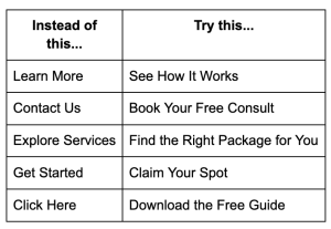
And here’s the part people miss: you need more than one CTA, placed strategically throughout the page. Don’t make someone scroll back to the top to take action once they’re finally convinced. Put a CTA above the fold, mid-page after your strongest selling point, and again at the bottom. Different people are ready at different points, meet them where they are.
3. Your Website Is a Maze and Nobody Has a Map
You have a lot to say. You offer a lot of things. You want people to know your story AND your services AND your blog AND your about page AND your testimonials AND your FAQ AND…
Stop. Breathe.
The more choices you give someone on a website, the less likely they are to choose anything at all. This is a real psychological phenomenon called decision paralysis, and it is silently destroying conversion rates on small business websites every single day.
Your navigation menu is not a sitemap. It’s a guided tour. And the best guided tours have a very clear path.
The fix: Audit your navigation ruthlessly. The sweet spot for a small business website is 4–5 primary navigation items, max. Everything else gets nested, moved to the footer, or cut entirely. Ask yourself for every page: Does this page move someone closer to becoming a customer, or am I just including it because I feel like I should have it?
Then design your entire site around a single primary conversion goal. For most small businesses that’s one of three things: book a call, make a purchase, or submit an inquiry. Every page should have one job, and that job is to move visitors one step closer to that goal.
4. You’re Missing the Trust Layer (And Trust Is the Whole Game)
Here’s something that separates online conversion from in-person sales: when someone walks into your shop or shakes your hand at a networking event, trust gets built through tone of voice, body language, and human connection. On a website, you have to manufacture all of that with pixels and words.
Most small business websites skip this almost entirely. They list services, maybe include a nice photo, and then wonder why nobody books. What’s missing is social proof; the digital version of a friend saying “I’ve worked with them, they’re amazing.”
And no, one testimonial tucked at the very bottom of your About page does not count.
The fix: Make social proof impossible to miss. This looks like:
- Testimonials with faces and full names placed near your CTAs, not just on a separate “Reviews” page nobody visits
- Before/after results or case studies that show the transformation you create
- A visible client count, years in business, or notable stats (“Served 200+ Massachusetts small businesses” hits differently than “Experienced team”)
- Press mentions, features, or certifications displayed with logos near the top of the page, not buried in a footer
- An embedded Google review widget so visitors can see real, verified feedback without leaving your site
The goal is that by the time someone reaches your CTA, they should feel like they’ve already gotten a referral from a trusted friend. That’s the trust layer. Build it visibly, and build it early.
5. Your Copy Sounds Like Everyone Else in Your Industry
Go look at three competitors’ websites right now. I’ll wait.
Back? Did they all use phrases like “passionate,” “dedicated,” “high-quality,” “personalized service,” and “committed to your success”?
Of course they did. Because those words are safe. And safety is the enemy of conversion.
When your copy sounds identical to every other business in your category, you give visitors absolutely no reason to choose you over anyone else. You become a commodity. And commodities compete on price, which is a race to the bottom you do not want to run.
The fix: Find your brand voice and use it like it’s the only tool you’ve got. Your brand voice is the combination of how you say things, what you’re willing to say that others won’t, and what personality comes through in every headline and sentence. It’s not about being quirky for the sake of it, it’s about being unmistakably, memorably you.
Practically, this means:
- Write the way you actually talk to your best clients. Record yourself describing what you do and transcribe it. That is your starting point.
- Use specific, concrete language over vague adjectives. “We respond to every client within 24 hours, always” is more convincing than “exceptional customer service.”
- Don’t be afraid to name who you don’t serve. “This isn’t for you if you want the cheapest option in town” is a bold move, and it makes the right people trust you immediately.
- Inject personality into unexpected places: your 404 error page, your booking confirmation email, your FAQ section. Delightful copy builds loyalty in the places people least expect it.
6. Your Website Works Beautifully, on a Desktop Nobody Is Using
This one is brutally straightforward and still somehow universally ignored: more than 60% of web traffic now comes from mobile devices. If your website wasn’t built mobile-first, you are actively driving away the majority of your potential customers.
And it’s not just about whether things “technically” fit on a phone screen. It’s about whether the experience is actually good. Are your buttons big enough to tap? Does your text require pinching and squinting? Do your images load in a reasonable amount of time on a cellular connection? Is your CTA visible without scrolling endlessly?
Page speed is in this category too. A one-second delay in load time can reduce conversions by up to 7%. If your site is loading slowly; because of unoptimized images, bloated plugins, or cheap hosting, you are literally paying a conversion tax every single day.
The fix:
- Pull up your website on your actual phone right now. Not the mobile preview in your website builder, your real phone. Browse it like a stranger would. Note everything that frustrates you.
- Run your site through Google PageSpeed Insights (free) and fix the top issues it flags.
- Compress every image on your site. Tools like TinyPNG or Squoosh are free and will dramatically reduce load times.
- Make sure your primary CTA button is visible and tappable on mobile without any scrolling.
If your site isn’t passing your own sniff test on mobile, it’s time for a real conversation about your platform and setup.
7. You Have No System for Capturing People Who Aren’t Ready Yet
Here’s the conversion truth that most website advice skips over: most people who visit your website are not ready to buy on that first visit. Research consistently shows it takes anywhere from 5 to 12 touch-points before someone becomes a customer. Your website is usually touchpoint number one or two.
So when someone lands on your site, gets interested, but isn’t quite ready to book or buy. Then leaves, what happens? For most small businesses, the answer is: nothing. They’re gone forever.
This is a massive missed opportunity, and it’s completely fixable.
The fix: Give visitors a low-commitment way to stay connected before they’re ready to buy. This looks like:
- A freebie or lead magnet — a useful download, checklist, guide, or quiz that’s genuinely valuable and requires an email to access. (“Download: The 10-Question Brand Audit Every Massachusetts Small Business Should Do,” yes, I’m biased, but you get the idea.)
- A newsletter worth subscribing to — not just “sign up for updates” but a specific promise of value. “Monthly tips on [specific thing] for [specific audience]” converts infinitely better than a generic email signup box.
- Retargeting setup — once your Meta Pixel or Google Tag is installed, you can run small-budget ads that specifically target people who’ve already visited your site. The conversion rates on retargeting campaigns are dramatically higher than cold traffic because you’re reaching people who already know you exist.
The goal is to build a relationship, not just a transaction. Your website should be the beginning of that relationship, not a one-shot gamble.
The Bottom Line
Your website is not a brochure. It’s not a business card. It’s not just a place to list your services so people know you exist.
Your website is your best salesperson; one that works 24 hours a day, seven days a week, without a salary or a sick day. But only if you’ve actually equipped it to do the job.
The businesses winning online right now aren’t winning because they have the most beautiful websites or the biggest budgets. They’re winning because their websites are clear, intentional, and built around the needs of the person reading, not the ego of the person who owns the business.
Start with one fix from this list. Just one. Make it this week. Then come back and do the next one. Your website is never finished, it’s always a work in progress, and the businesses that treat it that way are the ones that keep growing.
This is a contributed blog post written by Samantha Ward, founder of Sour Patch Studios, a boutique digital creative studio helping small businesses across Massachusetts and beyond show up boldly and consistently online. From brand identity and website design to social media strategy, Sour Patch Studios specializes in making small businesses look and feel as good as the work they do. Are you interested in submitting a guest blog post? Fill out our contact form.
What's the state
of Massachusetts
small businesses in 2026?
Enter your name and email address for our State of Small Business in Massachusetts 2026 report to find out. You'll also receive weekly emails from us!
Leave a Reply